Discover
Product Design Internship
Led the UX Strategy behind the redesign of the Manage Cards page to improve the navigation experience and help users find what they need with confidence.
Role
Product Design Intern
UX Strategist
Engage product family
Timeline
10 Weeks
Keywords
Design Strategy, UX/UI Design, User Testing
Overview
Led the UX strategy for a redesign of the “Manage Cards” mobile app page, serving 1.2 million monthly users. The card management experience is a core feature within the Discover mobile app that houses features like the digital wallet, card security, and physical card controls.
The Problem — A disorganized navigation experience
The structure of the Manage Cards page is largely undefined and does not align with user expectations. Our analysis revealed an experience that lacks clear wayfinding.

How this impacts the business:
Negative influence on user satisfaction
More money spent taking customer service calls
Reduces Discover's competitiveness in the digital wallets space
Opportunities
Group features based on functionality
Hierarchy should reflect what's important
Update visual design to communicate functionality
Research Methodologies
What we wanted to know
What are users' main struggles?
What features do users prioritize?
What are users missing?
Research I explored
Card sorting study
Content ranking
Engagement metrics
Usability testing
Competitive analysis
Journey maps
Competitive Analysis
Business Data

Key Insights
In the current architecture, information appeared visually grouped together
Users prioritized security features and preferred them to be easily accessible
Users desired a distinction between physical and digital experiences and their associated features in mobile apps
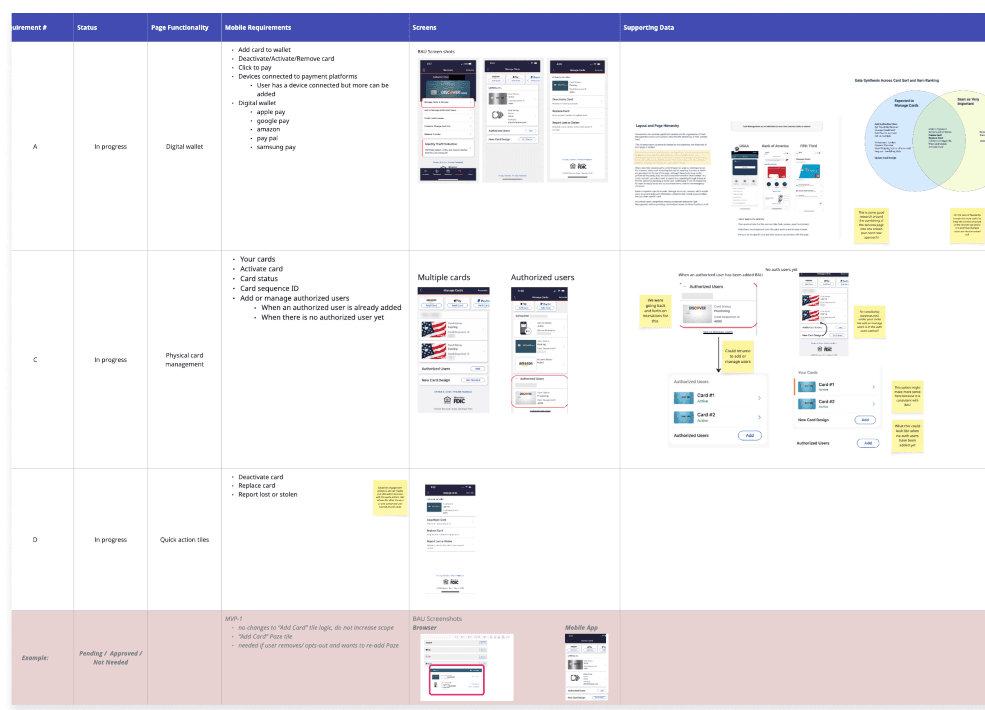
Solution Overview
In collaboration with design teams, I supported the strategy and design behind both a North Star prototype that prioritized long-term solutions and a MVP prototype that prioritized existing feasibility and business constraints.


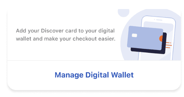
Digital Wallet
Created a clear separation from physical card features by nesting the page
Copy indicates the purpose of the digital wallet
Engaging illustration aligns with competitiors and boosts interest

Gathering Feedback
Stakeholder Workshops
Designed activities to collect feedback on UI and strategy
Aligned teams across design, leadership, engineering, strategy, and consumer insights on design direction
User Testing
2 online click tests with 209 banking users ages 18+
A/B user test between MVP and North Star designs
Goal: Understand which version helps users complete tasks most successfully
Impact & Outcomes
15%
Users were 15% more successful completing key tasks in the North Star version than in the MVP version.
Improve customer experience →
related to basic card functionality
Enhance engagement →
in Discover's digital wallet feature
Enhance page flexibility→
by restructuring page layout
Better self-service, reducing agent calls and overall frustration
Increase spending in the digital wallets space
Simplify the integration of new products
What I learned
Communication skills: I planned meetings with teammates to exchange insights, share feedback, and aligned on timing and next steps
I improved my analytical skills using competitor analysis and business data to uncover opportunities that align with stakeholder goals
Practiced empathy in uncovering opportunities to improve customer experience using insights from user testing
Using a design system to create rapid prototypes outlining design iterations
Reflection
This project emphasized the importance of prioritizing user needs while balancing business and technical constraints. Working in an agile workflow taught me to work efficiently throughout each phase of the design process.
Research in the form of competitive analysis, engagement analytics, and user testing strengthened my ability to design strategically, make with data-informed decisions, and rationalize iterations with user feedback. I also understood how to navigate constraints when creating new user interfaces while using a design system.